Creating a peaceful and relaxing atmosphere in your home starts with the colors you choose. Calm colors have the power to soothe the mind, reduce stress, and make any space feel welcoming. But with so many options available, choosing the right hues can feel overwhelming. Whether you’re repainting a single room or refreshing your entire home, selecting calm colors calls for a thoughtful approach.
In this post, we’ll explore practical tips for choosing colors that promote serenity in your living spaces. From understanding color psychology to combining shades effectively, you’ll be equipped to create a home that feels like a true retreat.
Why Choose Calm Colors?
Before diving into color choices, it’s helpful to understand why calm colors matter. Colors can influence our moods and emotions, and certain shades are proven to help people feel more relaxed.
– Reduce Anxiety: Soft blues and greens are known to lower heart rate and calm nerves.
– Promote Restful Sleep: Neutral tones and muted colors create soothing bedroom environments.
– Encourage Mindfulness: Gentle pastel shades foster a peaceful mindset throughout the day.
Choosing calm colors isn’t just a design preference—it contributes to your overall well-being.
Key Tips for Selecting Calm Colors
1. Start with a Neutral Base
Using neutral colors as your foundation helps set a balanced and harmonious tone.
– Shades like beige, taupe, soft gray, or creamy white work well.
– Neutrals are versatile and pair smoothly with other calming colors.
– They keep the space light and open, avoiding overstimulation.
Consider painting large areas, such as walls and ceilings, in these neutral tones.
2. Explore Cool Colors
Cool hues have a naturally calming effect. Blue, green, and lavender are excellent choices to promote tranquility.
– Blue: Evokes feelings of calm, peace, and stability.
– Green: Represents nature, growth, and freshness.
– Lavender: Offers a gentle balance with subtle warmth.
Keep the shades muted or pastel to avoid vivid or bright colors that can agitate.
3. Use Warm Colors Sparingly
While calm spaces usually lean toward cool or neutral colors, small doses of warm colors can add a cozy touch.
– Soft peach, blush pink, or light sand tones add warmth without overwhelming.
– Use these as accent colors—on cushions, curtains, or small decorative items.
Warm colors in moderation help balance the overall palette.
4. Consider the Room’s Purpose
The function of each room affects the best color choices for calmness.
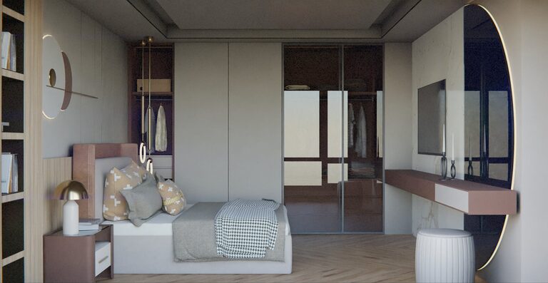
– Bedrooms: Opt for soft blues, gentle grays, or light greens to encourage restful sleep.
– Living Rooms: Warm neutrals paired with cool accents create inviting yet relaxing spaces.
– Bathrooms: Crisp whites, pale aqua, or seafoam green offer a spa-like feeling.
Tailor your color selection to how you use the space every day.
5. Incorporate Natural Elements
Color schemes that reflect nature tend to promote relaxation effortlessly.
– Bring the outdoors in by using earth tones like moss green, stone gray, or muted browns.
– Wood furniture and natural fibers complement calm color palettes.
– Add plants to enhance the connection to nature and add subtle greenery.
Natural inspirations create a grounding environment in any home.
6. Test Colors in Different Lighting
Lighting can dramatically change how colors appear in your rooms.
– Test paint samples on your walls and observe them during various times—morning, afternoon, and evening.
– Pay attention to natural light but also consider your artificial lighting.
– Some calm colors may warm up or cool down depending on lighting conditions.
This ensures your chosen colors maintain their soothing quality throughout the day.
7. Use Monochromatic or Analogous Palettes
Choosing colors next to each other on the color wheel helps maintain calmness.
– Monochromatic palettes: Use various shades and tints of a single color for subtle variation.
– Analogous palettes: Combine colors that are adjacent on the wheel, like blue-green and green, for harmony.
Both approaches reduce contrast, which can feel hectic.
8. Limit Bold Patterns and High Contrast
Busy patterns or high-contrast color schemes can increase visual noise.
– Opt for simple designs or solid colors for larger surfaces.
– Use patterns sparingly in textiles or small decor items.
– Keep the overall look uncluttered to enhance calmness.
Minimalism works hand-in-hand with calm color choices.
Final Thoughts
Choosing calm colors for your home is a wonderful way to foster a peaceful and inviting environment. Start with neutrals, add cool and muted hues, consider the purpose of each room, and test your colors under natural and artificial light. By thoughtfully selecting your palette, your home will become your sanctuary from everyday stress.
Remember, calmness isn’t just about color—your surroundings also benefit from thoughtful furniture placement, natural elements, and clutter-free spaces. Together, these elements create a harmonious setting for relaxation and well-being.
Happy decorating!
—
If you enjoyed these tips, be sure to check out our other posts on home decor and color inspiration!